What is the Best Nutrition Guide - Food Pyramid or Plate
Pyramid vs Plate Which is Better?
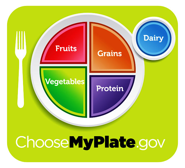
The USDA Food Pyramid(MyPyramid) has been squashed down onto a plate (MyPlate).
But is MyPlate any better visually as a guide to healthy eating?
Are there better alternatives that will do the job better?
The Food Guidelines image is meant to convey the fundamental principle about what you eat.
This includes the relative proportions of the food types and guidelines about foods to avoid.
But the new MyPlate design falls well short of this primarily because of its design.
We explore what is wrong with it and how to make it better.
What graphic is best in terms of providing the advice for healthy nutrition?
What Guide is Best?
The promotional image of the USDA nutrition guidelines have been change once again from the Pyramid to the Plate.
The Food Pyramid nutrition guide has been constantly criticised both for the image used
(What other systems use a pyramid?) and for its flawed information base and wrong information it conveys about nutrition and diet.
The Pyramid has been squashed down to the plate (MyPlate). But is it any better? The answer is No! When will the ever learn.
USDA plate is a fuzzy non-symmetrical version of a 'pie diagram'.
You couldn't recreate it on a plate with a pizza cutter, because the sectors do not pass through the centre.
This means that it is very hard judge proportions. There are no percentages for the 'slices'.
Why is it so strange and unconventional - why is the image fuzzy?
Another point is the dairy foods are added as a side serve. Once again this does not work. The guidelines are encouraging people to eat more vegetables and fruit, which are often included in the meal as side serves. While it may be good to suggest that Dairy foods shown be optional to the meal it conveys the message that all side serves should be optional.
The image does not work in terms of proportions as it is hard to judge the relative sizes and how they add up. For example the guidelines suggest that 50-70% of foods should be fruit and vegetables. But this is not immediately obvious from the image.
The images does not make any suggestion about reducing portion sizes - there was a chance to do this (see revised image).
The message it conveys is that if you get the proportions right you will have a good diet.

Origins of the Food Pyramid
The original USDA Food Pyramid has been universally criticises as being misleading and conveying the wrong message.
Visually is doesn't work because it implies a foundation of basic foods that is the base of the pyramid.
The concept of a pyramid was pinched from a Swedish idea first developed by Anna Britt Agnsäter in the publication 'KFs: Test kitchen' in 1974.
USDA got the idea when some of its researchers attended a conference in 1988. The Pyramid concept is poor for showing relative proportions and it has not kept up with scientific research on nutrition.
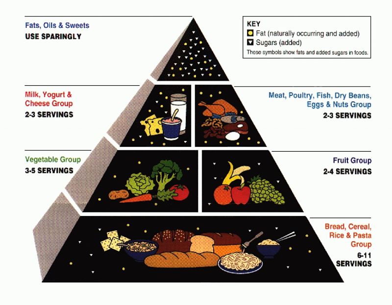
The Food Pyramid - 1992
The original food pyramid made various claims that were simply incorrect and misleading:
- All fats are bad: This is not true as polyunsaturated and monosaturated fats are OK, and fats from nuts, olive oil, fish, and grains are good. Trans-fats and saturated are definitely bad.
- All complex carbohydrates are good for you: This is not true. The recommendation of 6 to 11 servings of carbohydrates a day is far too high. Also there is no distinction between highly refined carbohydrates, such as white bread and pasta, and genuine complex carbohydrates, such as brown rice, whole grain cereals, oats and bread.
- Protein is protein: This is not true. Some types of protein and the foods that contain them are good for you, others are not. For example, red meat is a good source of high quality protein, but meat is high in saturated fat and cholesterol. Other sources of protein such as fish, turkey, chicken and even pork have much lower levels of saturated fat. Nuts and beans, including soy beans are also healthy sources of protein.
- Dairy products are essential: This is also not true, as there are other ways of getting enough calcium in the diet.
- Potatoes are good for you: This is not true as fried and baked potatoes have high levels of fat and potatoes are pure starch and provide little fibre and other nutrients.
- There is no Guidance on portion sizes, exercise, alcohol, weight, essential nutrients and vitamins
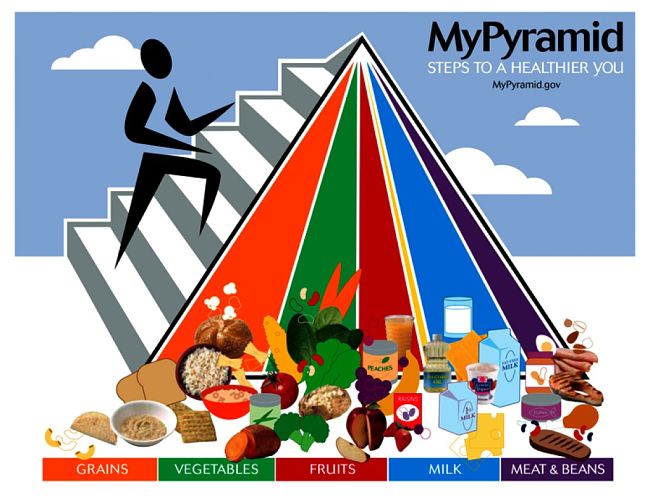
The MyPyramid design was frankly weird.
- It shattered the basic concept of a pyramid with successive layers.
- Why have someone climbing up the side?
- It offered Very Strange Advice
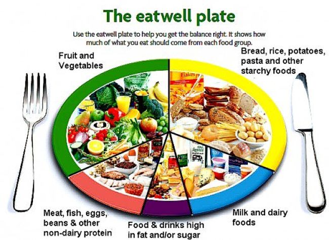
UK Eatwell Plate
Are there better alternatives? Yes the British Eatwell Plate (see image) is a much better image and guide. The recommended percentages are:
- Fruit and vegetables: 33%
- Bread, rice, potatoes, pasta: 33%
- Milk and dairy foods: 15%
- Meat, fish, eggs, beans (protein) :12%
- Foods and drinks high in fat and/or sugar: 7%
The guide recommends that you try to get this balance every day, or over several days or a week.
Based on the recommendations you should eat:
- Lots of fresh fruit and vegetables (at least five portions every day).
- Lots of whole grain rice, potatoes, cereals, bread, pasta and other starchy foods
- Small amounts milk and dairy foods (low fat varieties preferred)
- Restricted amounts of fish, meat, eggs, beans and other non-dairy proteins
- Very small amounts of foods and drinks that are high in sugar and/or fat
- Try to choose options that are lower in salt when you can.
Conclusion
The Eatwell Plate is a much better image as it conveys a simpler message and gives a better indication of proportions.
Current Version of MyPLate - USDA with additional images